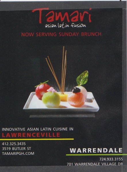
Words and visuals are not enough. Words, charts, illustrations and photographs are just the starting point. To succeed in communicating your ideas, you must organize your words and graphics into attractive, easy-to-read layouts. Often a business or restaurant may want a redesign of their existing layout to something more appealing or fresh. Nikki Schutz redesigned this Asian restaurant ad in three different concepts, utilizing Adobe Illustrator and typography from dafont.com. Excellent work!.
Joe Roenker / IMC Intro to Desktop Publishing


Speak Your Mind