Package design is deceptively simple. Many designers wrongfully approach this task as merely a matter of aesthetics and give no thought to the fact that packaging has to succeed on many variables. The fact that a package is created to hold a product is really a secondary goal from the designer’s perspective. From where you’re sitting, a package is created to sell a product. Many designers like to approach packaging as their own little canvas of creativity and the current trend is towards minimalism: the less the better. As much as we designers would love for that to be true, it simply isn’t always the case.
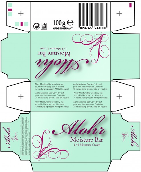
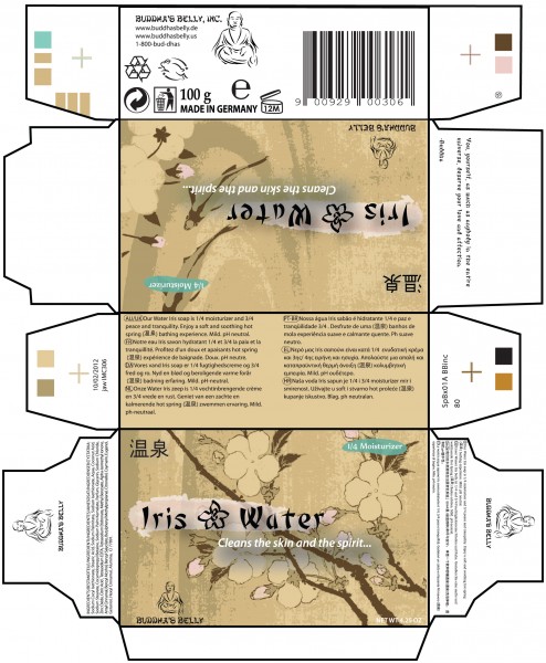
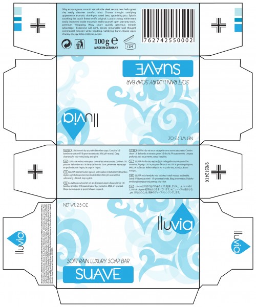
Elizabeth Wessing, John Winegarden, and Genevieve Lohr did a fabulous job in these layouts by displaying enticing graphics and beautiful color theory to catch the buyer’s attention. Layouts were built in Adobe Illustrator along with utilizing brushes in Adobe Photoshop for added graphics. Also, all Typography, Barcodes, Ingredients and every piece of line art were rebuilt in Adobe Illustrator. Notice the spot colors and registration marks; these are ready for print and packaging! Fantastic job to all!
Joe Roenker / IMC Intro to Desktop Publishing


Speak Your Mind